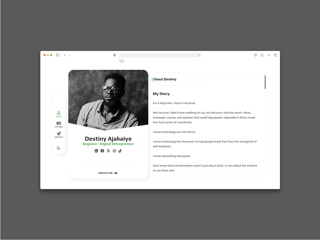
This case study examines the personal website of Destiny Ajakaiye, a software engineer and digital entrepreneur. The website is a professional portfolio designed to introduce visitors to Destiny’s background, philosophy, and contact information.
Problem Statement
The website, destinyajakaiye.com, serves as a digital hub for Destiny Ajakaiye. Its primary purpose is to:
- Introduce Destiny Ajakaiye: Provide a brief biography and personal story.
- Showcase Expertise: Highlight his roles as an software engineer and digital entrepreneur.
- Communicate Philosophy: Share his ideas, strategies, and systems, particularly concerning technology’s role in Africa.
- Facilitate Connection: Offer clear contact methods for visitors.
Design and Layout Analysis
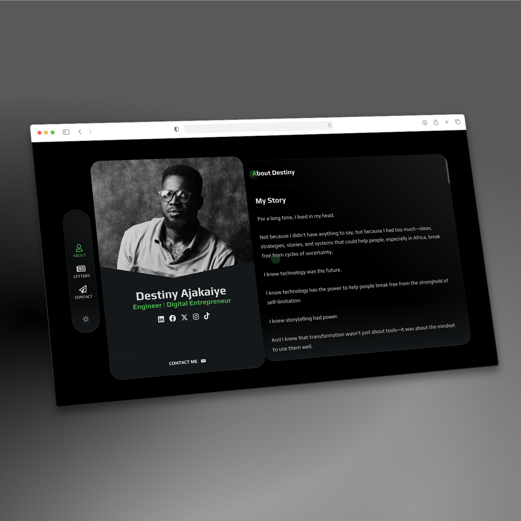
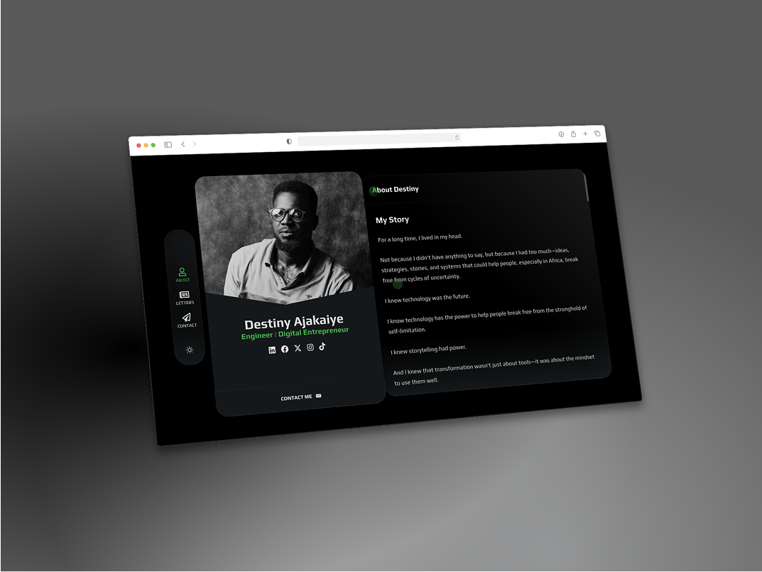
The website features a modern, clean, and minimalist design, predominantly using a dark theme with white and green accents, which often conveys professionalism and a contemporary feel.
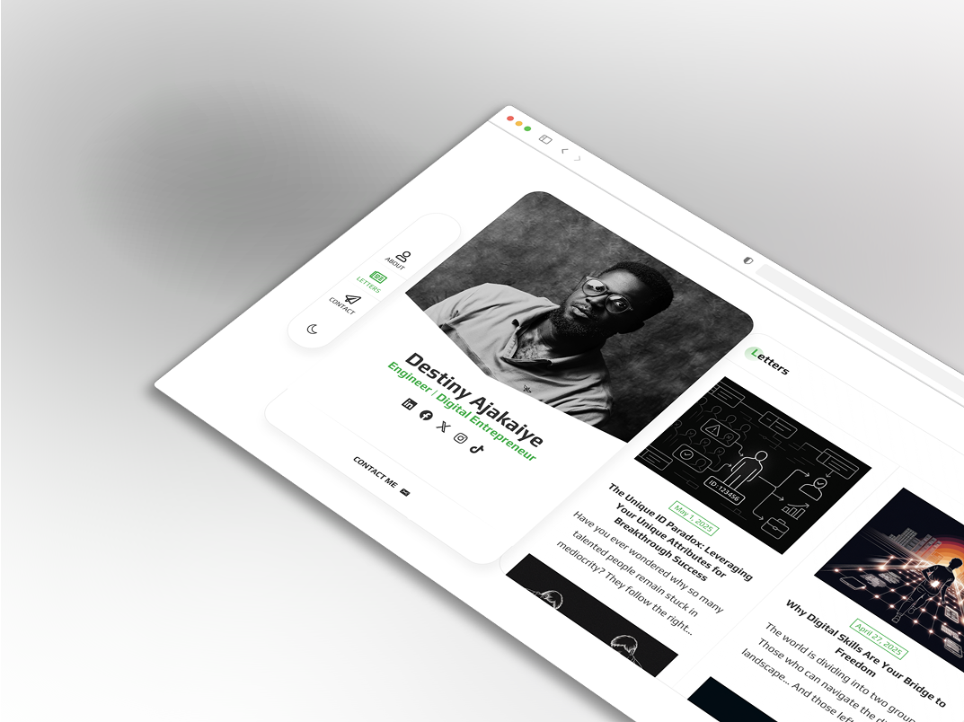
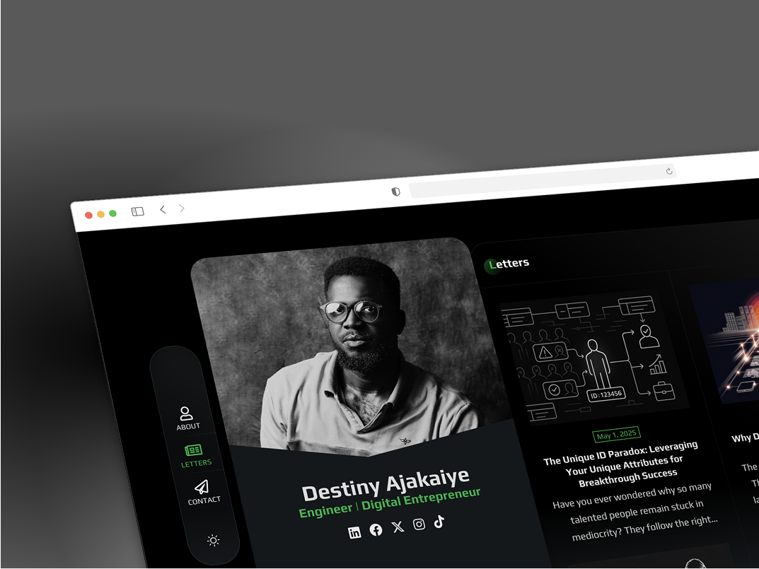
- Left Sidebar/Navigation: A fixed left sidebar contains key navigation links: about (currently active, highlighted in green), letters, and contact
- A sun/lightbulb icon (for theme toggling, e.g., light/dark mode). This consistent navigation allows users to easily move between sections without cluttering the main content area.
Content and Messaging
- The content is personal and aspirational, focusing on how Destiny’s ideas and expertise can help others, particularly in Africa.
- Personal Narrative: The “My Story” section creates a relatable connection with the audience by sharing a personal journey and the motivation behind his work.
- Problem/Solution Framing: He identifies a problem (“cycles of uncertainty,” “stronghold of self-limitation”) and positions his knowledge (ideas, strategies, stories, systems) and tools (technology, mindset) as solutions.
- Key Themes: The repeated emphasis on “technology” and “transformation” clearly communicates his areas of interest and impact. The mention of “Africa” suggests a specific geographic focus for his entrepreneurial efforts.
User Experience (UX) Considerations
- Clarity and Simplicity: The layout is uncluttered, making it easy for visitors to understand the site’s purpose and navigate.
- Visual Hierarchy: The prominent image, name, and titles, followed by the “My Story” section, guide the user’s eye effectively.
- Call to Action: The “CONTACT ME” button is a clear call to action, encouraging engagement.
- Accessibility: The dark theme with contrasting text generally offers good readability, though a light mode toggle would enhance accessibility for different user preferences.
- Responsiveness: Responsive on mobile, tablet, and desktop to ensure a good experience on various devices.